
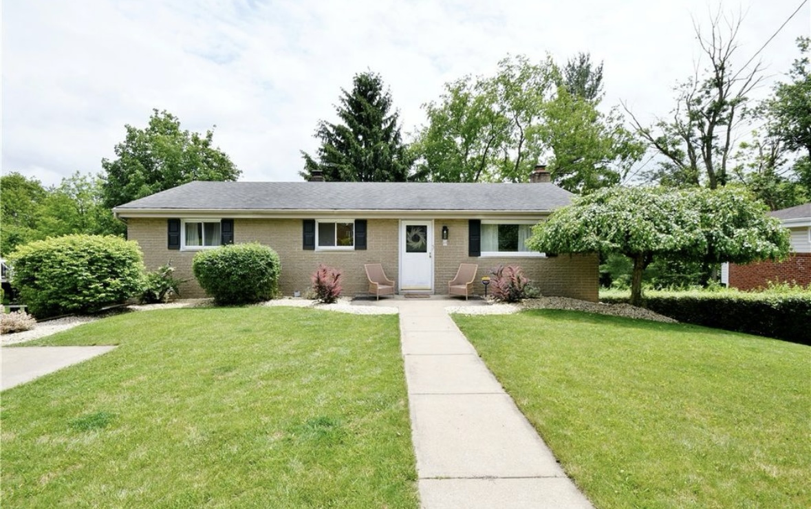
When my husband and I bought our first home in 2021, the housing market was anything but forgiving. Homes were moving quickly, buyers had little time to think, and waiting for the perfect house wasn’t exactly an option. We had to make decisions fast.
The home we ultimately purchased wasn’t necessarily our style. It was a ranch-style house with dated finishes, a somewhat challenging layout, and plenty of things we knew we would eventually want to change. But underneath it all, we saw potential. And sometimes, that’s all you need to get started.
At around 1,500 square feet, our home isn’t huge, which meant every design decision had to serve a purpose. We wanted a space that felt light, comfortable, and timeless without sacrificing the storage and functionality we needed for everyday life. We also love entertaining, so creating rooms that felt open and welcoming was just as important as making them beautiful.
Our biggest challenge? Finding ways to make the most of the space we already had, rather than wishing we had more of it.
Looking back, some of the changes that made the biggest difference weren’t necessarily the most complicated. A lighter color palette, new flooring, thoughtfully placed furniture, and a few clever storage solutions completely changed the way our main living spaces felt.
Here’s how we approached the living room, kitchen, and dining room—and the design decisions that made the biggest impact.
The Living Room: Creating a Better Flow in an Awkward Layout
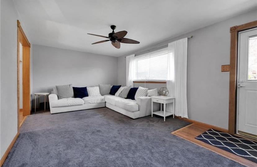
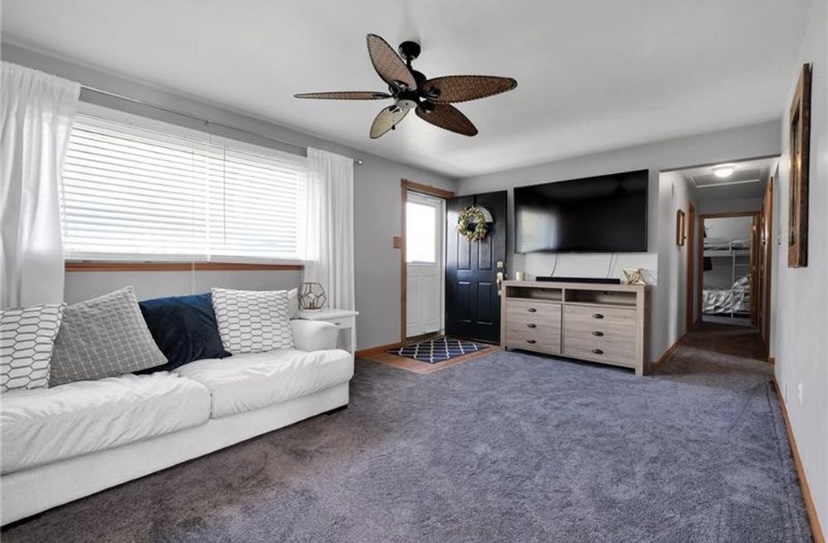
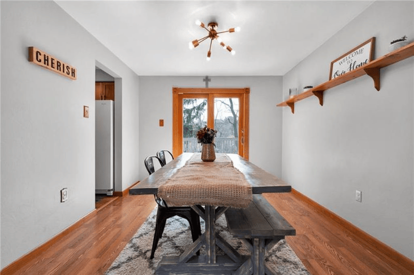
When we first moved in, the living room felt darker, heavier, and more closed off than it needed to. The gray walls, dark carpet, and warm wood finishes made the space feel dated, but the layout was an even bigger challenge.
The room had so much potential. It was one of the main features that attracted us to the house, thanks to its generous size and the opportunity to comfortably entertain guests. But figuring out how to arrange the furniture was another story.
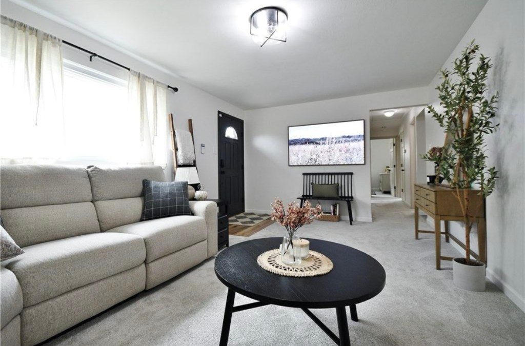
There wasn’t an obvious place for the television that worked naturally with the couch. One wall opened into the dining room, while another was interrupted by the front door. The remaining wall was relatively small, making a traditional entertainment center difficult to accommodate.
With the previous furniture arrangement, walking through the front door felt like walking straight into an obstacle course. There was also a large, awkward wall across from the entry that didn’t seem to serve much of a purpose.
We knew we needed to rethink the room—not just decorate it.
1. Brightening the Room With a Softer, More Timeless Color Palette
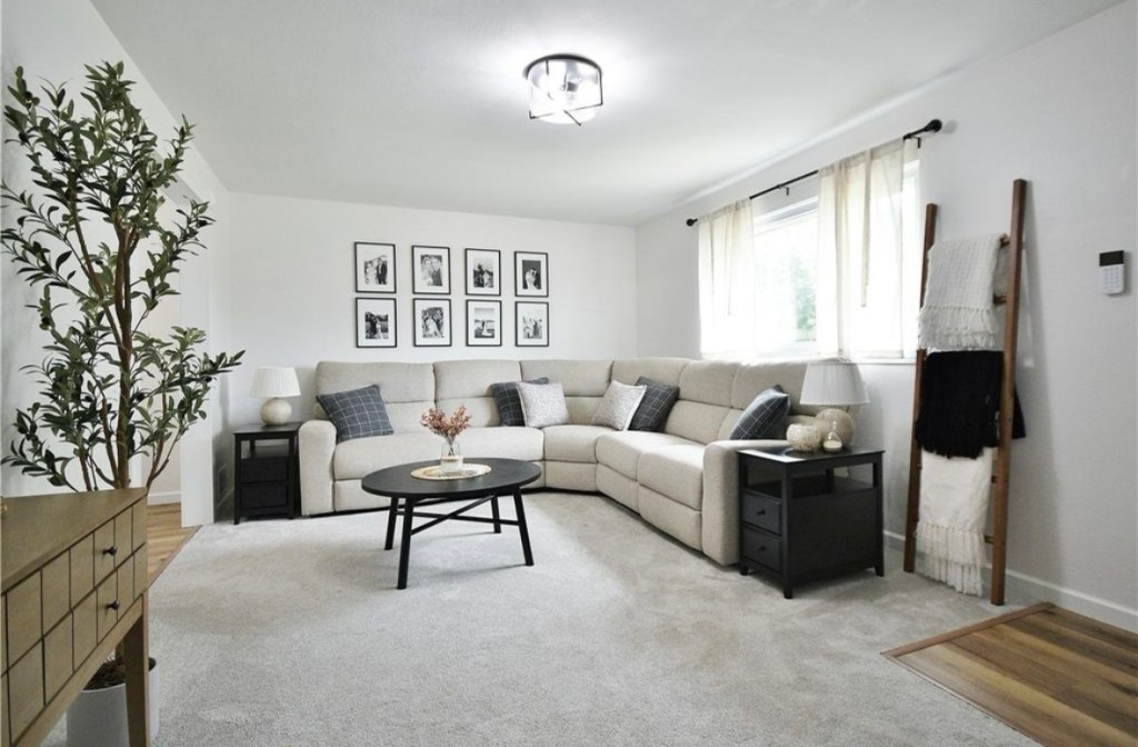
One of the first changes we made was refreshing the wall color. The original blue-gray tones and orange-toned wood finishes competed with one another, making the space feel heavier than it actually was.
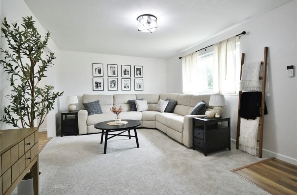
We chose Marshmallow by Sherwin-Williams for the walls. It’s a soft off-white that brightens the room without feeling stark, especially when paired with the crisp white of the baseboards and trim.
That subtle contrast was important to us. We wanted the house to feel fresh and cohesive, but not so stark that it lost its warmth.
The lighter walls immediately helped the room feel more open and gave us a neutral foundation to build on. Instead of having to work around the original color scheme, we could introduce texture, natural materials, and decor without everything competing for attention.
2. Replacing the Dark Flooring to Transform the Entire Space
If there was one renovation that made a dramatic difference throughout the house, it was replacing the flooring.
The original carpet was dark and dated, and no amount of styling could fully compensate for how much it weighed down the room. Since our goal was to brighten the home from the ground up, new flooring was an important investment.
We hired a local flooring company for this project, which ended up being the only major project in these spaces that we contracted out. Most of the other updates throughout the house were things we tackled ourselves.
Although new flooring was one of the more expensive changes, it gave the entire space a fresh starting point. The lighter finish worked with our updated wall color, made the rooms feel more cohesive, and helped the house feel more current without requiring a complete renovation.
Sometimes, the best way to refresh a room isn’t to add more things. It’s to change the elements that are making the space feel dated in the first place.
3. Turning Our Television Into a Design Feature
This might be my favorite decision in the entire living room—and one of the most practical.
Because of the layout, we didn’t want the television to dominate the entryway or force us into an awkward furniture arrangement. We needed a solution that allowed the living room to function as a living room without making the television the first thing everyone noticed when they walked through the door.
That’s when we decided on the Samsung Frame TV.
Mounted on the wall, it functions as a television when we’re watching something, but when it’s not in use, it displays artwork. We used the frame that came with ours to give it a more finished, gallery-like appearance.
The result is one of those features that people don’t always recognize right away. Guests often assume they’re looking at a framed piece of art until I pick up the remote and switch it to the television.
Beyond its appearance, mounting the TV helped us work around the unusual layout and preserve the feeling of a separate entryway. It gave the wall a purpose without needing a bulky entertainment center or taking up valuable floor space.
It’s a great example of how a design choice can solve a practical problem while also making a room feel more intentional.
4. Finding Storage in Places We Would Otherwise Overlook
In a smaller home, storage has a way of becoming a design problem. You need somewhere to put everyday items, but you don’t necessarily want every wall covered in bulky furniture.
We started looking at our existing layout differently: instead of asking where we could fit another cabinet, we asked how we could make the furniture we already needed work harder.
The narrow but deep end tables beside the couch were a great example. Their two deep drawers and lower shelf provide far more storage than you might expect from their footprint.
We also added a console table to the awkward wall across from the front door. What was once a wall we didn’t know how to use became a functional part of the room, giving us additional storage and a place to style decor.
Since taking the original photos, I’ve added decorative storage bins beneath the entryway bench and underneath the console table. These are small changes, but together they help keep everyday clutter out of sight without sacrificing the look of the room.
I love finding pieces that serve two purposes: furniture that looks good but also makes daily life a little easier. In a smaller home, those are often the purchases that make the biggest difference.
Shop this look: ShopMy Living Room Collection
The Kitchen and Dining Room: Making Every Inch Count
The living room wasn’t the only space that needed a little creativity. Our kitchen and dining room presented their own set of challenges.
We were working with limited counter space, no dedicated pantry, and less storage than we would have liked. The existing wood flooring and trim also felt at odds with the more modern lighting in both rooms. Combined with the blue-gray walls, the orange and blue undertones throughout the house made it difficult to create a cohesive look.
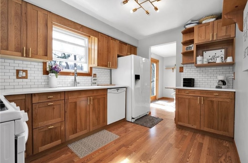
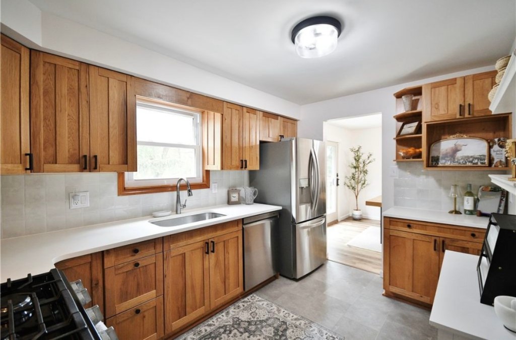
The good news was that the kitchen cabinets were already a classic Shaker style. Rather than replacing cabinetry that was still in good shape, we decided to focus on the elements around it.
Our goal was to make the rooms feel lighter and more connected while finding ways to improve storage and functionality.
5. Updating the Kitchen Without Replacing the Cabinets
Replacing kitchen cabinets can be one of the most expensive parts of a renovation, so we wanted to avoid that expense if we could.
Fortunately, our existing cabinets had a timeless Shaker profile. The bigger issue was how their warm wood tones interacted with the rest of the room.
We updated the wall color and trim to match the approach we had taken in the living room, then replaced the flooring. In the kitchen, we chose luxury vinyl plank with a tile-like appearance.
I wanted a lighter look that would help the kitchen feel more open without clashing with the existing cabinet finish. The tile-inspired flooring gave us that updated look while allowing us to keep the cabinets.
The result was a brighter kitchen without the cost or disruption of a full cabinet replacement.
We also added a white trash-can cabinet to conceal the trash in a much more intentional way. It looks cleaner than a freestanding bin and provides an additional surface we can use when we need a little extra room.
It’s one of those changes that seems small on its own, but it makes the kitchen feel more organized and functional.
6. Creating a Coffee and Tea Station Without a Pantry
This was one of the trickier problems to solve.
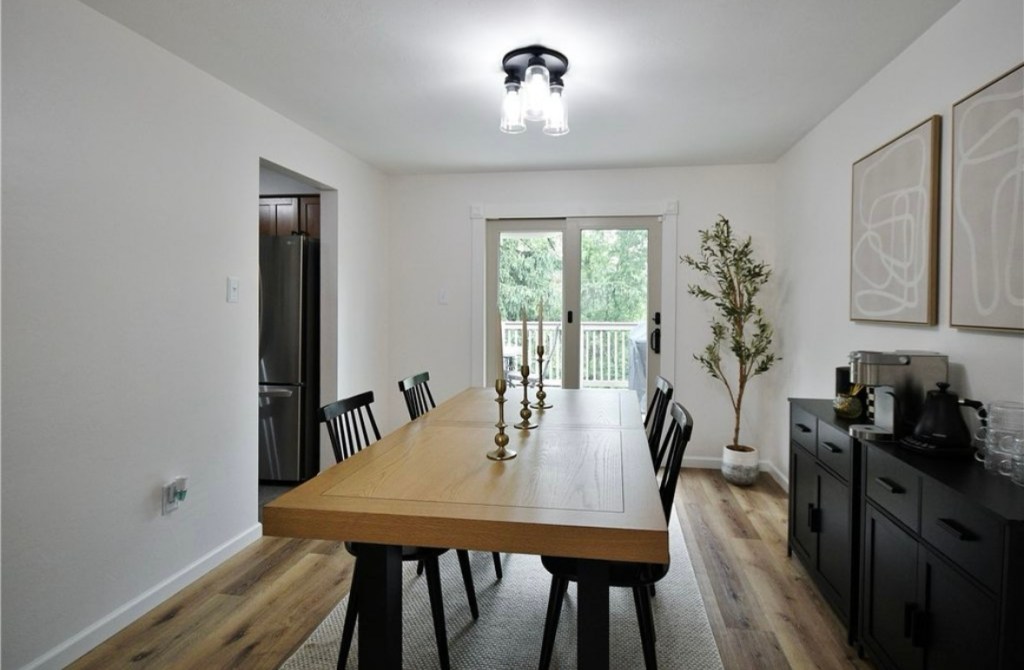
My husband is a coffee drinker, while I’m a tea drinker, so having a dedicated spot for our Keurig and electric kettle was something we really wanted. The problem was that our kitchen had very little counter space to spare—and no pantry to help with storage.
We needed a place for our coffee and tea essentials, but we also wanted additional room for the things that didn’t fit comfortably in our existing cabinets.
The dining room offered a possible solution. We needed to keep the dining table centered beneath the light fixture, but the largest wall still had enough room for additional cabinetry.
Finding the right cabinets took longer than expected. They needed to be narrow—around 12 inches deep, or just slightly more—so we could add storage without making the dining area feel cramped or interfering with the flow of the room.
It was worth being patient. The right depth made all the difference between adding useful storage and creating another obstacle to walk around.
This area gave us a dedicated place for our coffee and tea setup, freed up precious kitchen counter space, and helped compensate for the lack of a pantry.
It also reinforced something we learned throughout this renovation: you don’t always need more square footage. Sometimes, you just need to use the square footage you already have a little more thoughtfully.
Shop this look: ShopMy Dining Room Collection
What We Learned From Updating Our Small Home
Looking back, we didn’t need to completely change the layout of our house or renovate every room to make it feel different. The biggest improvements came from identifying what wasn’t working and finding practical ways to address it.
A few lessons stand out:
- Start with the elements that affect the entire room. Wall color and flooring can influence how spacious, bright, and cohesive a home feels.
- Don’t replace what doesn’t need replacing. Keeping our Shaker cabinets allowed us to put our budget toward updates that made a bigger visual impact.
- Make awkward spaces work for you. An unusual wall, narrow corner, or underused area might be an opportunity for storage rather than a design problem.
- Choose furniture that works harder. Drawers, shelves, hidden storage, and decorative baskets help keep a home functional without adding unnecessary clutter.
- Be patient when shopping for small spaces. The right dimensions can make the difference between a room that flows naturally and one that feels crowded.
Our home may not have been our dream house when we first walked through the door, but it had the potential to become a place that reflected our style and worked for our everyday lives.
And that’s what I love most about home design. You don’t always need a massive renovation or an unlimited budget to make a meaningful difference. Sometimes, it’s a series of thoughtful decisions that gradually transform the way a space looks and feels.
If you’re working with a smaller home, an awkward layout, or rooms that don’t quite reflect your style yet, I hope these updates give you a few ideas to try in your own space.
The best homes aren’t necessarily the biggest or the newest. They’re the ones that make the most of what they have.
Disclosure: This post contains affiliate links. If you purchase through these links, I may earn a commission at no extra cost to you. I only share products I believe may be useful to my readers.



Leave a Reply